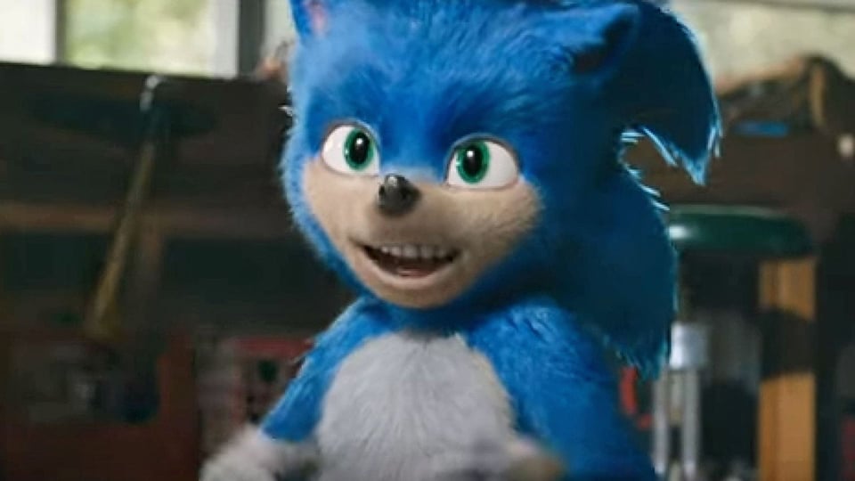
So the first Sonic the Hedgehog movie trailer dropped earlier this week and, well… let’s just say the fan reaction wasn’t great. Everything from the CGI to Sonic’s The Flash-like lightning abilities to the song choice of “Gangsta’s Paradise” was criticized. Nothing, though, topped the hate Sonic’s actual appearance received — a hate so powerful that even the movie’s director came out and shared that design changes would be coming.
What, exactly, went wrong during the movie’s pre-production that allowed a design that invoked such fan vitriol to go forward? Will Paramount Pictures be able to salvage this film in the face of all the negativity surrounding it? Will director Jeff Fowler stay true to his words and revamp Sonic’s design to be less…

Yeeeeeaah…
I doubt it. I mean, I’m not gonna pretend like I know really anything about the film production process, let alone one with a big CGI/animation budget, but I can’t imagine a complete revamp of Sonic’s design is in the cards. With the movie due out later this year, I can realistically only see a few attributes of Sonic’s look being tweaked. But I’d love to be proven wrong!
While we wait for news about an updated look for the Sonic the Hedgehog movie’s title character, we thought we’d share some of our favorite fan design concepts for the blue blur himself scoured from around the web. Be sure to leave a comment about your favorite one and check out the original artists’ other work, too!
1. Edward Pun’s design
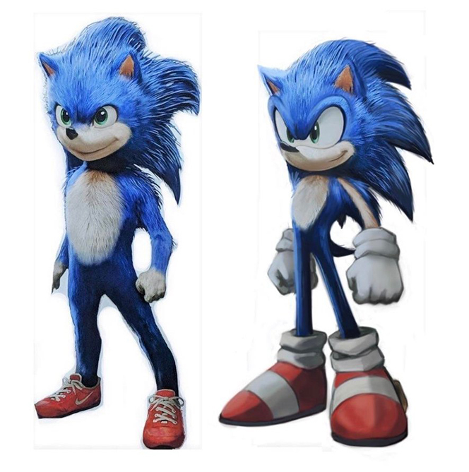
Left is original screenshot. Right is my rework to make #Sonic more stylized. pic.twitter.com/IhXeAZYlQI
— Edward Pun (@EdwardPun1) April 30, 2019
The first one on our list comes from Edward Pun, an artist at Sucker Punch, the makers of Ghost of Tsushima, Infamous, and more. His rework puts movie Sonic more in line of the game series’s modern design while retaining aspects of the film character’s look. Pun enlarges Sonic’s ears, eyes, and hands while shrinking other aspects like his legs, stomach, and overall body.
2. Aimée Calvacante’s design
i painted over a shot of the new sonic movie and it turned out a mix of classic and live action sonic lmao pic.twitter.com/RdJlXiY1ra
— Aimée 🦊 (@AimeeUeda) April 30, 2019
Artist Aimée Calvacante’s design mixes what she calls “classic and live-action Sonic” to create a sort of Disney-inspired look to movie Sonic. While it isn’t as true to Sonic’s video game appearance as Edward Pun’s design, Sonic’s enlarged eyes get it a bit closer.
3. 7K28’s design

Reddit user 7K28 posted his design concept for movie Sonic when the character’s appearance began making its rounds on the internet. 7K28 takes a bold approach to film Sonic and removes any elements from his original design — apart from the realistic fur. 7K28’s design stays incredibly true to modern Sonic’s game look, right down to his enormous running shoes.
4. Naoto Oshima’s design
今まで色々なソニックが現れたが全てを好きでいたい。私はソニック映画のトレーラーを観た。大人も楽しめるものを期待していたが心配です。
So far, various Sonics have appeared. I loved all Sonics. I saw a trailer of Sonic's movie. I was expecting adults to have fun too. I am worried. pic.twitter.com/QgBfrTJ700— Naoto Ohshima (@NaotoOhshima) May 2, 2019
Sonic and Dr. Eggman’s original designer Naoto Oshima also chimed in with his own design concept (who also hilariously stated “I am worried” in his tweet). While keeping in line with some of the movie Sonic’s design, Naoto gives him back a bit of what was lost during the game-to-film translation.
5. Unknown artist’s design

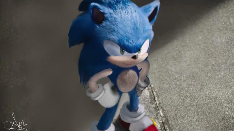
While we couldn’t track down the original source for this piece of art (although the artist’s signature is in the corner), this design, like 7K28 and Edward Pun’s, stays very true to game Sonic’s. His stature, eyes, and body are all very much respectful to the source material, as are his shoes (although without the Puma-branding, Paramount’s losing out on that sweet, sweet product placement money).
By the way, if you know who the original artist is for this piece, give them a shout-out in the comments section so we can properly credit them!
6. ThePinkGalaxy’s design
Sonic's movie design is… certainly something huh? Welp, here's my attempt at a redesign. #SonicMovie pic.twitter.com/PMLZAZhx9p
— ThePinkGalaxy (@ThePinkGalaxy55) May 2, 2019
Our final mention is ThePinkGalaxy’s design, which appears to be a cross between the Disney-inspired look of Aimée Calvacante’s and modern video game Sonic’s appearance. Returning are modern Sonic’s mono-eye, out-stretched nose, and iconic smirk.
What’re your thoughts? Do you have a favorite? Sound off in the comments, and be sure to check out all the artists’ profiles (and follow them) for more of their great work!
https://nintendowire.com/news/2019/05/03/6-sonic-the-hedgehog-character-designs-that-are-better-than-the-actual-movies/
2019-05-03 18:46:08Z
52780282674032
Bagikan Berita Ini


0 Response to "6 Sonic the Hedgehog character designs that are better than the actual movie's - Nintendo Wire"
Post a Comment